 At AIS, we work with clients to help define the overall vision, scope and detailed requirements for the applications they want to build. I recently had the opportunity to work on a project where a client wanted to reach a new set of users through a Windows Store app that was based on an existing iPad app.
We had a very short timeline and limited budget to work with. That was the bad news… The good news was that we were able to use Microsoft Team Foundation Server (TFS) — in this case the TFS 2010 version — in conjunction with Visual Studio 2012. This gave us the opportunity to leverage new PowerPoint 2013 storyboarding stencils for defining the app’s User Experience (UX), and TFS for efficiently creating and managing our product backlog. We also used Visio 2013 for visually defining the overall functional scope and high-level release plan for the app.
In this post, I’ll share how we used these tools to rapidly define the requirements for the app, and talk about some topics related to converting the iPad app information architecture to a Windows Store app information architecture.
At a high level, the requirements approach we followed included:
- Analyze the iPad app to define the vision and scope for the Windows Store app by building a map of the iPad app structure and functionality in Visio 2013. We used this map to make decisions on what features to include in the Windows Store app.
- Conduct workshops with client subject matter experts (SMEs) to collaboratively define the Windows Store App User Experience with wireframes developed using Windows app storyboarding shapes in PowerPoint 2013.
- Build the product backlog and integrated test plan in TFS using the requirements and test work item types (user story and test case) available in the TFS Agile process template.
- Use TFS as the requirements information hub for our globally distributed team. All of the UX specifications and product backlog items were available to all team members through the TFS team project portal.
Now let’s look at each of these activities in a little more detail…
1. Define the Vision & Scope
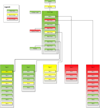
Since we were rebuilding an existing app, we could leverage the existing set of personas/user roles that had been defined for the iPad app. While role playing each persona and walking through the features of the iPad app, we used Visio 2013 to create a map of the iPad app UX structure. This map depicted the major navigation flows and navigation menu options, the tiles/panels of information/content displayed to the user in each major flow, along with any other architecturally significant UX elements such as controls, commands and dialogs, etc.
We color coded the different UX components to indicate which major release of the Windows Store app they would be targeted for. The figure below shows a generic version of the type of map we used. This helped us quickly define an initial high-level minimal viable product (MVP) scope from which we could create an initial set of user stories/epics for the minimal marketable features (MMFs) for the app.
Figure 1- Map of UX Elements and Primary Navigation Flows
2. Define the Windows Store App User Experience
Armed with our initial set of MMF user stories, we set out to define the user experience for the Windows Store app. The first key decision we needed to make was which Store app style (hierarchical or flat) would be best for the users to work with the app and view content in the app. (For reference, see this link for an explanation of the Windows Store app styles.)
We decided that the app would be a hierarchical style app that would consist of a hub page (with a couple of variations based various states of the app), and multiple section and detail pages.
We conducted a series of workshops with the client SMEs and approached the definition of the UX specifications from the “top -> down,” starting with the hub view and working down through each of the section and detail views by role playing each user role/persona and walking through the key user stories we’d previously identified. It is important to note that the workshops focused on the stories we considered to be architecturally significant, and stories that would be considered the “sunny day” scenarios. We did include a few stories that represented exception cases to work out the general UX features for error handling.
Since Windows Store apps are relatively new, we provided a tutorial on the design concepts for Windows Store apps in the first workshop and walked through several example hierarchical style apps in the Windows Store. The tutorial also covered design considerations regarding how Windows Store apps behave when displayed in portrait vs. landscape views, snap vs. fill views, along with the operation of the navigation bar, app command bar, and Windows Charms. This provided the team with a common understanding, and more importantly helped the team make informed decisions about how to distribute the app functions and information content across the hub, section and detail views, and when to introduce workflow within the context of a particular view.
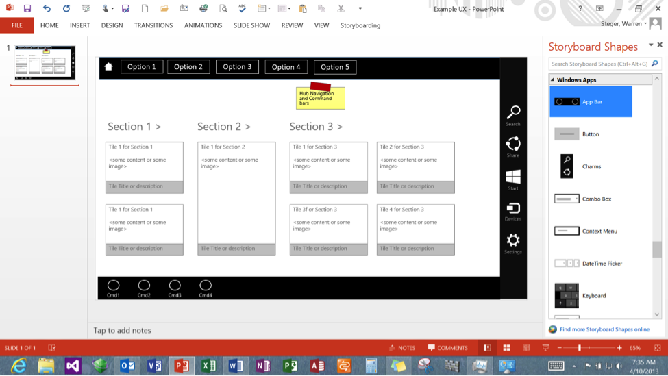
Prior to the start of each workshop, draft mock-ups were created in PowerPoint 2013 based on the set of user stories we planned to cover in that workshop. Having the out-of-the-box stencils for Windows Store app UX elements in PowerPoint 2013 allowed us to quickly build the wireframes that conformed to Windows Store style guidelines, and also enabled us to quickly adjust the UX in response to feedback from the SMEs. The rich set of Windows Store app UX elements in Powerpoint 2013 enabled us to depict in detail various control elements (i.e. flyouts, dialogs, messages) would be used in the different workflows and what app commands would be available in each view.
A generic example of the PowerPoint wireframe experience is shown in the following figure:
Figure 2 – Example PowerPoint Storyboard for a Windows Store App
We made a conscious decision at the start to separate the definition of the wireframes in PowerPoint from the actual visual design comps that would define the color schemes, backgrounds, fonts and other fine details in order to keep the workshop discussions focused on fully elaborating the user experience from a purely functional perspective.
During the final workshop, we did include a discussion of some candidate visual design concepts primarily focused on the app tile, splash screen and hub views, again working from the top -> down. The bulk of the visual design effort was performed AFTER we had reached consensus on the overall UX layout and navigation flows. The PowerPoint wireframes were kept deliberately “grayscale” in style to avoid focusing on the detailed design too early.
We used a dual projector setup in the workshops, one showing the draft PowerPoint wireframes for the Windows Store app and the other showing the original iPad app, to give the SMEs context on how each of the features and content of the iPad app had been realized in the Window Store app design style. The translation of features was not always perfectly equivalent, and providing a side-by-side view helped the SMEs see where the Windows Store app UX was able to leverage features unique to Windows apps, such as the Settings Charm and app command bar. In general, the information architecture of the iPad app and Windows Store app ended up being similar in terms of how the users were able to access content and how the content was organized into tiles in the section and detail views.
3. Build & Manage the Product Backlog in TFS
Once we had the UX specifications for the key user stories defined through the conversations with the SMEs, we constructed the product backlog for the Windows Store app using TFS user story and test case work items. Since some of the stories covered in the workshops were actually “epics” (i.e. “big” functional scope), we decomposed them primarily from a “big” activity to “smaller” activities perspective and/or from a business rules/data perspective. The latter decomposition approach was realized through the definition of story main flows, alternate flows and exception flows in order to account for different rule conditions and/or different classes of data being displayed or manipulated.
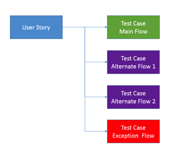
Because of the short time schedule, we decided to create parent user story work items linked to child test case work items, where the detailed requirements for the user story were elaborated in the test case work items. This allowed us to build the test plan in parallel with the requirements definition and jumpstart the testing process. For each story, we defined at least one test case that defined the primary workflow that the user role would be performing, and (as needed) defined additional test cases to cover alternative and/or exception situations related to the main flow. This approach allowed the testers to create the specific test conditions directly from the requirements contained in the test case summaries.
The figure below illustrates of how we defined the requirements and test work items in the product backlog in TFS. The test case work items were related to the user story work items through the standard “tested by” link type. We used a simple, straightforward template for each flow that defined the personas and pre-conditions (Given) for the flow, the steps in the workflow performed by the user and the system, along with business rules (When), and the expected post-conditions at the completion of the flow (Then). The post conditions served as the basis for acceptance criteria for each test case. The parent user story was just a brief description of the system capability embodied in the user story expressed using the form of “as a <user role> I want <some goal> so that <some reason>”.
Figure 3 – Structure of the product backlog work items in TFS (which doubled as a test plan)
We used standard TFS features to stack rank the user story work items in our product backlog, and created area paths that generally mapped to the structure of the Windows Store app information architecture of Hub/Section/Detail views along with general navigation/commands. We also created use stories to capture the non-functional requirements and the specific requirements for submitting an app to the Windows Store as defined in the Windows Store app certification process.
The stories/test cases were generally elaborated in “just ahead” fashion as we went through sprints and the developers and testers created task work items associated with each story to track the implementation and validation of each story in the Windows Store app for each sprint.
4. Using TFS as the Global Requirements Information Hub
We used TFS as our one-stop shop/single version of the truth for communicating all of the user story requirements for the Windows Store app to the project team, which was a globally distributed team located at various locations in both the US and India. The SMEs, developers, testers, UX designers, architect and management all had access to the product backlog work items in TFS, along with all of the UX wireframes we created in PowerPoint, which we stored on the team project portal. We also used the team portal to store reference documentation that had been used to build the iPad app.
Given the time constraints, we simply published the completed stories/test case descriptions to the TFS portal for review by the whole team and then responded to any questions/clarifications through emails or con calls as needed. TFS was used to track any changes to the requirements made during the sprints. We also used TFS to store the UX design comps that were developed for the app based on the PowerPoint wireframes.
In summary, we were able to leverage the power of Visual Studio, TFS and Office 2013 to rapidly and efficiently create detailed specifications that enabled the team to quickly develop and test the Windows Store application features. We received feedback from the remote development team that the PowerPoint wireframes in particular were key to their ability to understand the app workflow/navigation and the content available to the user at the Hub, Section and Detail levels. The user stories/test case requirements in TFS provided them with the detailed descriptions of the functionality needed in the app “behind the screen” to implement the required business capabilities within the app.
Please visit our website to learn more about the AIS approach to custom application development or to read more about our work building mobile apps.


