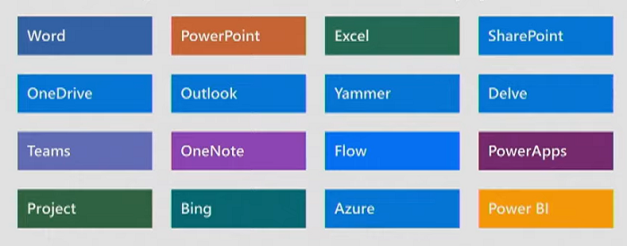
We live in fractious times! Let’s escape for a few minutes to consider how Microsoft is moving us toward calm and synchrony. Together with a consistent, organized design aesthetic, the Fluent Design System delivers a User Experience bridge across apps, platforms, and devices.
Fluent UI is a package of tools we can use to build for our customers faster and with a consistent UX.
Across Platforms

The Fluent Design System applies to five platforms: Web, Windows, iOS, Android, macOS (recently added). Fluent UI is the set of design tools within the overall System. We can use these toolsets to implement coherent, consistent design elements.
Many Names
Note that for Windows development, the design and toolset are being allowed to keep the existing name of WinUI. The Fluent naming changes are a moving target! Fluent Design System is a design language developed in 2017 as the successor to Metro at the introduction of Windows 10. Microsoft gave the name Fluent UI to the merge of two repositories, UI Fabric and another Microsoft UI library that was named Stardust. Browsing the Fluent Design website you will encounter places where Fluent UI is still named UI Fabric. We will see these become Fluent UI gradually. Having the names organized helps to deliver the Design System concept.
Native
Achieving a consistent look and UX appears a straightforward goal. But the challenge is more than meets the eye. Working Fluent Design smoothly into the native behaviors, elements, and controls of the many devices will require a balancing effort. The challenge is to respect each platform’s native elements and behavior while adding a uniquely Fluent feeling. Consider that Android devices are built using Google’s Material Design. Displaying Office on an Android device requires considering how the Fluent experience will work with the Material Design of the OS. It is worth the effort. Familiar user patterns across devices increase productivity for end-users. To help build natively, Fluent UI React Native was announced at Build, to allow easier cross-platform development.
A Coherent User Experience
Users are evolving and expecting a different experience. Today people use multiple devices and sometimes all at the same time. We want to let a user start work on one device and finish on another. Our cloud-powered, multi-device, cross-platform world has created a need and expectation of a consistent and coherent experience from one to the other.
“Fluent has taken Microsoft back to the basics of design, with a much bigger focus on simplicity. Instead of bold typography and edge-to-edge content, Fluent focuses on subtle elements like light, depth, motion, and material. We’ve seen it appear in Windows with hints of motion and blur effects. It’s also appeared in Office and on the web across services like OneDrive, Office Online, and Outlook. Microsoft is gradually making Fluent the centerpiece for how the company thinks about design.” –The Verge
Fluent UI React
Used by Microsoft 365 apps such as Outlook and SharePoint, Fluent UI React is also incorporated in the generators for SharePoint Framework, Office Add-ins.

Developing for Microsoft 365 apps using SharePoint Framework and Add-Ins is supported by having Fluent UI already included from the generator, to keep the design of webparts and add-ins consistent with the hosting product.
Design-to-Code
The Design-to-Code concept separates design from development to ease building on multiple platforms. Using a design tool such as Figma, Sketch, or Adobe XD, the designer sets UI elements once and can export the tokens to many development environments. It exports style tokens into machine-readable formats: XAML for Windows, compiled CSS for Web, and Swift for iOS.
“Most designers at Microsoft use Figma” – Medium
Getting Started
The deceptively simple Fluent site opens the way to a sizeable body of documentation and quickstarts. Choose your platform and jump in. From the Build presentation: “Our opportunity in the cloud-powered, multi-device and cross-platform world is for us to design seamless experiences that close the technology gaps and allow people to organize, manage, create and communicate wherever they are in ways they’ve never imagined before.”
Recap
- Fluent Design System helps build natural and productive experiences on each device
- Resources are available to build UX on Windows, Web, Mobile, and Cross-Platform
- Further improvements to come to improve design to code
Links
- https://medium.com/microsoft-design/how-fluent-ui-unlocks-the-next-generation-of-microsoft-365-experiences-8b24809faf06
- https://blog.prototypr.io/how-to-find-the-best-design-to-code-tool-f82dac425ae
- https://en.wikipedia.org/wiki/Fluent_Design_System
- https://www.theverge.com/2019/4/29/18515776/microsoft-design-open-fluent-prototypes-history
- https://www.microsoft.com/design/fluent/#/
- https://developer.microsoft.com/en-us/office/blogs/ui-fabric-is-evolving-into-fluent-ui/
- MS Build SK131 Fluent Design System – Building apps that feel natural on every device


